top of page


CSR — Magazine reader Application Design
ABOUT CSR MAGAZINE
Competition Success Review, often abbreviated as CSR, is a general at students who wish to appear for Union Public Service Commission exams. Its content includes general knowledge with a focus on Indian current events, tips for college interviews, interviews with IAS high-rankers, interview and GD tips and sample question papers for different competitive examinations. It was first published in 1964 as a pull-out supplement.
Anchor 1
AI-Driven Workflow Optimisation for Titan's Watch Faces Design
CONTEXT
The project aimed to create a design system workflow using AI for watch face generation. Key outcomes included AI prompt engineering, a comprehensive design assets library and a robust workflow, aligning design, development, marketing, and product teams.
4
Designers
50
Days
2
Brands
20+
Products
20k
Watch faces
THE PROJECT BRIEF
The initial brief for the project was to design 2,000 implementable watch faces for two brands and over 15 products within 50 days. However, after conducting primary research and qualitative interviews with stakeholders from the development and marketing teams, the brief was redefined to:
Create a seamless design system workflow that synergizes the efforts of the design, development, and marketing teams to generate watch faces using AI and Extensive assets library.
THE PROCESS
The process we followed for this project was not as linear or straightforward as it may appear. However, here is my best attempt to represent all the steps involved in a linear timeline.

Anatomy of AI- Designed watch faces

Assets From the Design Assets Library
AI generated Image
The Challenge

Design Assets
The initial brief for the project was to design 2,000 implementable watch faces for two brands and over 15 products within 45 days. However, after conducting primary research and qualitative interviews with stakeholders from the development and marketing teams, the brief was redefined to:
=
AI generated Image
+
Watch face
Two Brands
Screen sizes
Types of Interactions
Screen Resolutions
Data display
Ablities
Different USPs
to promote
Different briefs
based on products
Vector
conversion
prompt Engineering
Default watchfaces
Festive, event,
occasional watchfaces
Cloud watchfaces
Image implementation
capabilities
Image
manipulation
THE CONCERNS
Here are some key concerns and pain points of all the stakeholders in their own words


THE SOLUTION
The proposed solution involved integrating the following four pillars of the new optimised design system.
The New Workflow
Design Complications Index (DCI)

Design Assets Library (DAL)
Brief, Feedback & Approval formats
THE NEW WORKFLOW

The Design Complications Index (DCI)
The Design complication index is a comprehensive catalogue detailing various types of watch faces and the parameters required to create them, this pillar of the new design system sets clear expectations for the design, Development Marketing teams during the initial stages of the project

The Design Assets Library (DAL)
The Design Assets Library is created to provide designers with a standardised set of design elements. This ensures consistency across all projects, streamlines the design process, and allows designers to work more efficiently by reusing established components along with AI to create watch faces seamlessly.
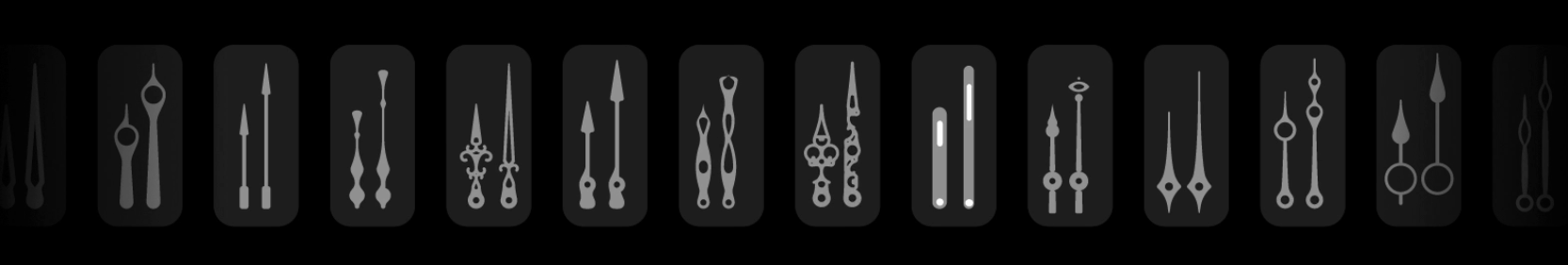
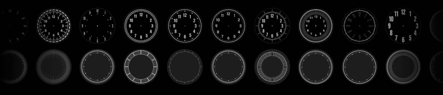
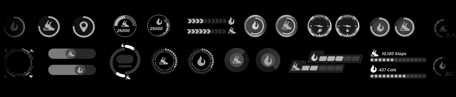
Digital watchfaces asset library-

Compositions :
The key phase in designing watch faces is composition. A set of compositions enables quick creation by combining design assets, speeding up the process while aligning with specific briefs.

By varying colors, textures, and text combinations, multiple watch faces can be created from the same composition. Here's an example:

Metal texture library :
In addition to existing design assets, a dedicated Metal texture library allows designers to create variations of watch faces, particularly metallic and classic styles.

THE FINAL OUTCOME
Here's a glimpse of the watch faces crafted using AI and our streamlined workflow, now enjoyed by Titan and Fastrack smartwatch users. This project not only delivered innovative watch faces but also showcased how AI can drive efficient and prolific project execution for the organisation.

Series 1


Series 2


Series 3


MY LEARNING FROM THE PROJECT
1. Convincing Higher Management to Adopt New Technology
In this project, I learned that simply explaining the benefits of new technology like AI isn't always enough to convince higher management. I initially sent an email requesting the adoption of an AI image generation tool. However, it was only when I created and presented sample watchfaces that the management truly understood the potential. This visual demonstration proved far more effective than words alone. As a result, they not only approved the use of the AI image generation platform Midjourney but also encouraged the entire organization to leverage AI for increased project efficiency and pace.

2. Practical Use of AI in Design workflows and systems
While AI has proven to be a valuable tool, it’s clear that human intervention is still crucial, especially when ensuring the visuals meet audience preferences. Currently, AI cannot create design assets that require precise dimensions, geometry, and vector formats, such as indices, dials, hands, and numbers. Therefore, while AI can generate creative concepts and initial designs, human designers are essential for refining these elements to meet technical and aesthetic standards.
3. Integrating AI with Design Systems and Workflows
The integration of AI into established design systems and workflows can enhance flexibility and efficiency. Design systems provide a robust structure for designers to maintain consistency and optimize workflows within an organization. AI can enhance these systems by generating variable elements like images and text, and by using machine learning to recognize and categorize content. This integration adds value to both design workflows and systems, but only if designers see AI as a tool and make it an integral part of their process.
Thanks for watching
Please leave your comments on this project
SEE ALSO
bottom of page