top of page
CSR — Magazine reader Application Design
ABOUT CSR MAGAZINE
Competition Success Review, often abbreviated as CSR, is a general at students who wish to appear for Union Public Service Commission exams. Its content includes general knowledge with a focus on Indian current events, tips for college interviews, interviews with IAS high-rankers, interview and GD tips and sample question papers for different competitive examinations. It was first published in 1964 as a pull-out supplement.
Anchor 1

Iconography Design for the Titan Smart Watches & Mobile Application
ABOUT TITAN SMART WATCHES
Titan Company Limited (Titan) is the fifth largest integrated watch manufacturer globally. Traditionally recognized for its analogue watches, Titan offers a range of well-known brands, including Sonata, Fastback, Titan, Nebula, and Raga. As the market shifts towards smart wearables, Titan has expanded into the smartwatch sector with its Titan Smart and Fastback Smart brands. This venture has propelled Titan to become India's fourth largest smartwatch company. This project narrates the journey of designing the new iconography for Titan smartwatches for the brands- Titan smart World & Fastrack smart.
THE PROJECT
Our project encompassed extensive research, the creation of numerous concepts and moodboards, and the development of various visual designs. From this process, we selected the primary theme: "The Echoes of Earth and Nature in Bold Minimalism." This theme inspired all visual elements, including colors, forms, and the motion of the new iconography. We deconstructed natural elements into specific metaphors, color schemes, and moodboards.
We initially selected eight root icons and explored three distinct directions, ultimately developing five different styles. These styles were presented to all stakeholders and tested with users. We chose the one that received the most significant approval and positive feedback from customers.
From there, we delved deeper into the Nature and Earth concept, building a strong relationship between this idea and the company’s central vision. We also analyzed different forms found in nature and explored how these forms could be utilized to create recognizable iconographic shapes. This led to the creation of various types of icons, each reflecting different natural elements.
The Research
We began with an in-depth user study, conducting qualitative research through one-on-one interactions with users. We held discussions with stakeholders from the marketing, sourcing, and sales departments and analysed user comments on the iOS and Play Store.
Next, we studied trends from credible sources and performed a deep dive into the competitive landscape, as the smartwatch market is highly specific with a limited number of competitors.
To establish design criteria, we gathered principles of good iconography from well-known and well-defined design languages, such as Microsoft's Fluent and Nielsen Norman Group’s icon usability guides.
THE INSPIRATION
The Echoes of Earth and Nature

Health and fitness synergy
The natural world symbolises health and well-being, aligning seamlessly with the health-conscious focus of smartwatch users.
Universal connection
Nature and earth provide a universal appeal, resonating across diverse audiences, making the iconography relatable to a wide user base.
Holistic Ethos
Commitment to a symbiotic relationship between technology and the environment, contributing to a more holistic approach
THE FORM DEVELOPMENT


THE FINAL FORMS

THE COLOURS
For smart watches, to optimise the battery, a dark theme is preferred. Taking the inspiration from the natural light sources against the dark background the color gradients are created.


THE CHARACTERISTICS OF THE NEW ICONS
The new iconography is to be used by both Titan and Fastrack smart brands, which cover a wide range of target audiences.
Neutral tone of Voice
Universal signifiers
Universal signifiers must be used for most of the icons for better recognition and recall
Bold, Minimal & Organic
From the trend study and secondary research these aspects are derived
Visible on small displays
The icons are designed considering their visibility on the smaller screens of the smartwatches
THE GRID FOR THE CONSISTANCY


Square
Portrait
Landscape
THE ICON SET


APPLICATIONS
GRID VIEW MENU
LIST VIEW MENU
MULTISPORTS RECORDS
THE MULTISPORTS ICONS
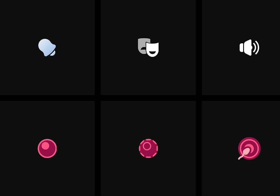
To ensure consistency across 200+ multisport icons, we developed a grid and guidelines. These standards maintain visual harmony not only within the multisport icons but also with the rest of the icon set.
ANIMATIONS
It takes 5-12 seconds to measure the health parameters. To make the waiting period interesting, the same icons are animated in such a way that the original form of the icon remains the same, yet they exhibit subtle pulsing, rotating elements, and color shifts. This ensures the user experience is engaging and visually appealing while waiting for the measurement to complete.


THE APP ICONOGRAPHY
The app supporting the titan smart watches, has a light theme. So the line iconography with the similar visual language is created for the app.


The watch icon
The app icon
Application of the line icons on the app maintaining the visual synergy with the solid watch icons


ALTERNATIVE CONCEPTS CREATED
Before arriving to the final concept
CONCEPT 1 : BOLD MINIMAL CLOSE-UP STYLE

CONCEPT 2: BRUTAL GLITCH LINE STYLE

CONCEPT 3: WARM & PUFFED STYLE
KEYWORD MAPPING AND SKETCHES


Thanks for watching
Please leave your comments on this project
SEE ALSO
bottom of page

