top of page


CSR — Magazine reader Application Design
ABOUT CSR MAGAZINE
Competition Success Review, often abbreviated as CSR, is a general at students who wish to appear for Union Public Service Commission exams. Its content includes general knowledge with a focus on Indian current events, tips for college interviews, interviews with IAS high-rankers, interview and GD tips and sample question papers for different competitive examinations. It was first published in 1964 as a pull-out supplement.
Anchor 1
Titan Smart World app Revamp for Enhanced Usability and Features
ABOUT THE APP
Titan, India's leading watchmaking company, has recently launched two smartwatch brands: Titan Smart World and Fastrack Smart.
The Titan Smart World app complements these smartwatches, providing users with access to their historical health data, advanced settings, and much more.

ABOUT THE APP REDESIGN
Earlier versions of smartwatches had limited features, and the accompanying Titan Smart World app mirrored these limitations. With the significant enhancements in the new advanced smartwatches, the old app struggled to accommodate the new features and interactions. Additionally, the previous app faced usability and data representation issues.
So, we decided to redesign the app, especially the dashboard. We also introduced a new design language to give the entire app a visual upgrade.
This case study will highlight the key changes in the app redesign, the data-driven decision-making process, and the impact these changes made.
INTRODUCTION

A typical smartwatch and its associated app work in sync for a better user experience. The two key aspects of the smartwatch and app relationship are:
1. Health Monitoring:
-
The smartwatch measures various health parameters like heart rate, SpO2, sleep, etc., and transfers the data to the app.
-
The app analyses and stores this historical data, making it easily accessible to users.
2. Settings and Customisation:
-
Complex settings of the smartwatch, such as watch face customisation and firmware updates, are managed through the app, allowing users to perform these tasks effortlessly.
UNDERSTANDING THE PROBLEM SPACE
Effectively redesigning this app was crucial due to the wide range of connected smartwatches with different data synchronisation methods, and the diverse user groups varying in age, gender, and technical proficiency.
We identified several significant issues with the current app:
-
Limited Dashboard/Home-screen: No scope for representing additional features on the dashboard or home-screen.
-
Inflexible UI: The user interface is not adaptable to new methods of health data synchronisation and representation.
-
Complicated Navigation and Feature Discovery: Users find it difficult to comprehend the top and bottom navigation, and key features are hard to discover.
-
Emotional Disconnect: The app lacks motivational and emotional validation, failing to provide an intuitive and engaging user experience.
-
No Scope for Promotional Content: There is no provision for adding promotional content, running campaigns, or having different themes.
The app dashboard/home-screen has the most significant issues, so it has been prioritised in this redesign exercise.
We wanted to improve four key business metrics through this redesign exercise :
1. Increase Engagement and Session Length:
We observed that interactivity on the dashboard, specifically for the daily summary wheel and daily goals, was low despite occupying prime space.

Users spend minimal time interacting with the summary wheel, and daily goals.
The session lengths decrease significantly after the dashboard is opened 5-10 times.
Old app
2. Boost Feature Adoption Rate:
Some features, such as active tasks, the Zeta point system, and certain health features, are under-utilised by users.

The app's "Zeta Points" reward system for daily goal completion is under-utilised and poorly understood by many users.
New health features are underused because accessing them from the secondary bottom navigation menu is complex for users.
Old app
3. Enhance App Ratings and Reviews:
Due to various issues related to usability, functionality, and aesthetics, the app received negative reviews and lower ratings on the Play Store and iOS Store.
DESIGN PROCESS AND CHALLENGES
-
To address emotional disconnect, user perceptions, and behaviors, we conducted qualitative interviews with twelve users using the Titan app and other fitness, smartwatch, and mindfulness apps.

-
To guide the app redesign, we categorised user feedback using the Six Minds framework. This synthesis highlighted key improvements and informed our design strategy.

-
For the app redesign, we synthesised data from user studies, internal reviews, and sales and marketing teams to derive actionable insights and findings.

ITERATIONS
-
Low-fidelity wireframes and sketches streamlined the design process, saving time and aligning cross-functional teams with project goals. This approach quickly highlighted potential issues and ensured stakeholders remained on the same page.

I. REDEFINING THE DASHBOARD STRUCTURE
The first interaction users have with the app is the Home Screen. The previous design presented an overwhelming experience due to numerous touch-points. The daily summary wheel occupied most of the above-the-fold space, combined with top and bottom navigation, leading to a disorganised layout.

Top navigation
Daily health
summery wheel
Daily goals
Daily tasks
Bottom navigation
OLD DASHBOARD
From qualitative interviews and stakeholder interactions, we identified the bento box tile layout as an effective solution for the issues in the old dashboard. This layout provides a clear, organised space to display limited data and serves as structured entry points for all features.

Daily goals
Daily tasks
Daily health features
Bottom Navigation
NEW DASHBOARD
II. THE DATA REPRESENTATION
In the older version, data representation posed comprehension challenges for users. Additionally, new data synchronisation methods from the smartwatch to the app were incompatible with the previous design.
1. Health Data Representation:
The app used a summary wheel to display synchronised health data and daily summaries, which made integrating new features challenging.
- Synchronising all data simultaneously became problematic with the addition of new features.
- The summary wheel had an unusual interaction method, creating a steep learning curve for new users.

Users need to rotate the spindle to view round-the-clock data
Sleep zones during sleep at night
health Data at the time
pointed out by the spindle
Active time zones
(During multisports and other activities like walking)
Heart rate zones
Old representation
Utilizing individual cards for health features allows users to compare data, view daily summaries, and highlight abnormal readings for attention. User studies revealed that users prefer to see their health parameters at a glance, with the option to click on the cards for detailed information if desired.

Health vitals
readings
Measuring duration
Timespan when the vitals are measured
Last activity performed
My cycle data tile
Sleep zones
Time at which the last reading is taken (Auto measurement)
Overview graphs
Time at which the last reading is taken (manual measurement)
New representation
Users can customise their experience by rearranging or hiding health cards, including the abnormal readings card, according to their preferences.

Edit option applicable for My health section
For re-arranging and hiding the health vitals on the dashboard

Alert on the health vital cards when abnormal readings are detected
1. Goals and Active tasks
The representation of goals and active tasks lacked motivation for users, leading to the underutilisation of the Zeta points reward system.

The goals
The active tasks
Old representation
To enhance user motivation, we added progress rings and bars next to the Zeta points target, positioning the goals tile at the top of the dashboard. These visual elements align with users' mental models, making it easier to associate with their goals and targets.More active tasks can also be added according to the new requirements as per new watch features.

The goals
The active tasks
New representation
III. THE NAVIGATION AND FEATURE DISCOVERY
-
The navigation system was inflexible, complicating the integration of new features.
-
Users struggled to understand the navigation, leading to difficulty in discovering frequently used features.
-
The top and bottom navigation proved overwhelming for users, adding to their frustration.

Top navigation - Community, Active well-being, rewards
Primary bottom navigation
Secondary bottom navigation
(Within health section)
Old dashboard
-
We streamlined navigation by retaining only the bottom navigation bar.
-
Features from the top navigation, such as Community and Rewards, have been integrated into the bottom navigation, while Settings remain unchanged.
-
Based on analytics showing that watch faces were the most-used feature, it has been repositioned to the lead navigation for easier access.

The bottom navigation
Home, Rewards, Community, Watchfaces, Settings
New dashboard
IV. DEFINING THE VERSATILITY
The dark mode of the app is defined using a carefully selected colour palette to ensure visual clarity and maintain a cohesive user experience.

Light mode
Dark mode
The new layout and design system enable the addition of new features and unique selling points for advanced smartwatches. It also supports the integration of promotional content on the updated tiles.

As the lead feature of the smartwatch, Medication Management has been prominently integrated into the dashboard.
For the smart ring, the measure option has been integrated into the app on the vital tiles.
Titan health suite, promoted as a USP for the medically certified smartwatch


Additional Feature
One year after implementing the first phase of the project which we have seen so far in this case study, new features were needed, including watch face customisation. from here onwards let us see how this additional feature is created.
Interaction Design for Intuitive Watchface Personalisation
CONTEXT
Titan smartwatches offer a range of customisable features, including the ability to change backgrounds, dials, and hands. Users can also select their preferred features, colors, and themes for the watch faces, allowing for a highly personalized experience.
THE GOAL
The core goal of the project is to provide personalisation and creative satisfaction for users of Titan smartwatches while they customise watch faces through the Titan Smart World mobile app and make this complex process intuitive.

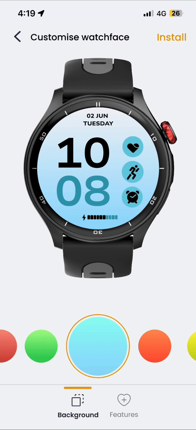
Customization options are easily accessible through quick access menus and list views, reducing the steps needed to find features. This additional capability is prominently integrated into the quick access menus on the watch faces dashboard.
Accessibility of Customization Options
Drawing insights from user research and competitive analysis -
we identified common interaction patterns in default mobile applications for image and video editing, as well as in social media post customization workflows. To align with these familiar paradigms, we crafted the watch face customisation experience with a focus on usability and intuitive design.
Changing Background from the multiple options
-
Consistency with Familiar Patterns: Emulating the look and feel of popular editing interfaces to reduce the learning curve.
-
Intuitive Controls: Incorporating bottom navigation for edit controls, sliders and the familiar UI elements to simplify adjustments of backgrounds and other features.
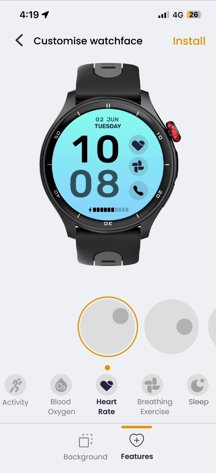
Selecting the features on the specific positions

Setting up a background image from photos involves selecting the color and positioning the features according to the user's preferences
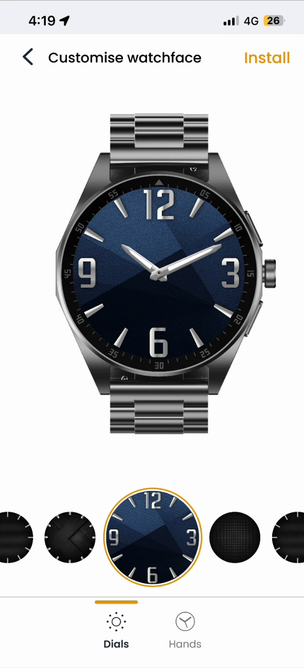
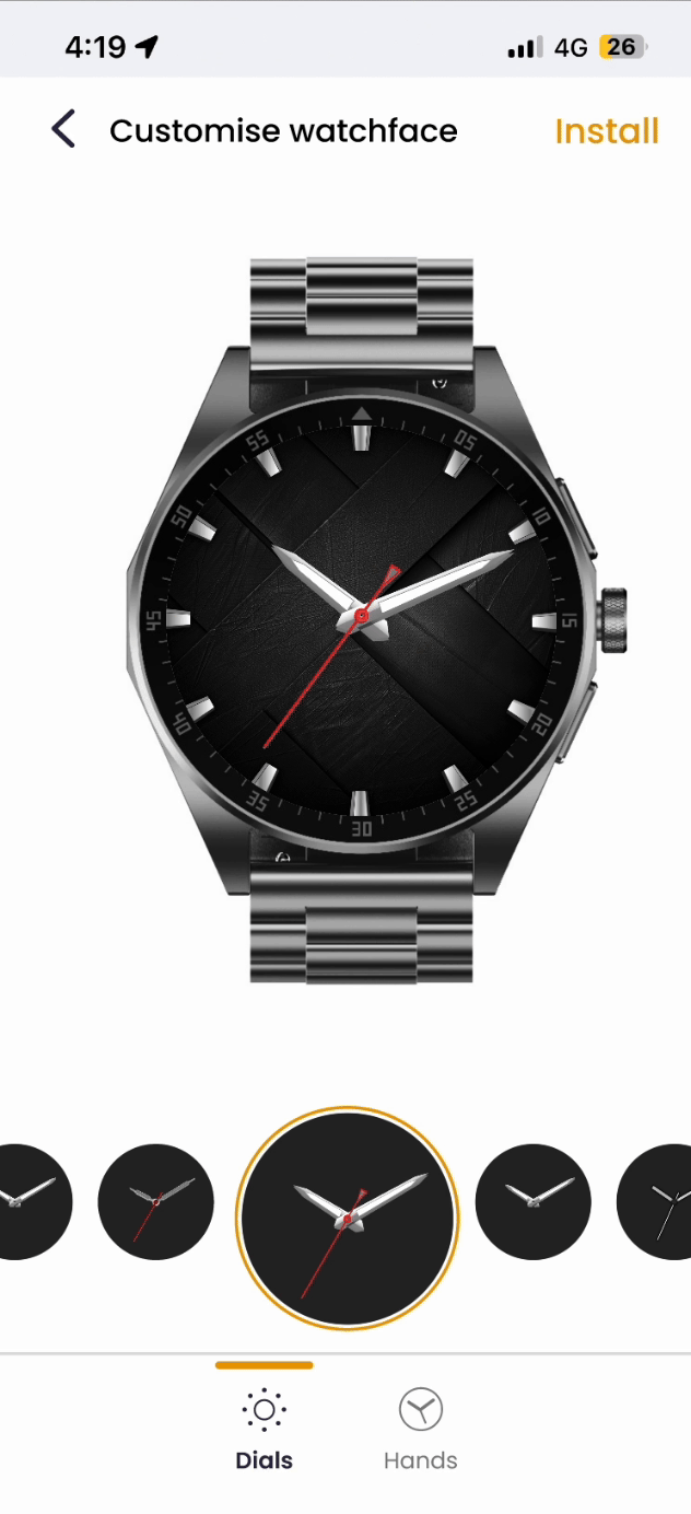
To provide an experience that fosters creative satisfaction, we’ve allocated ample space for users to craft their watch face artwork. Including a realistic representation of the actual watch model serves as a vital frame, allowing users to visualize how their customized watch face will appear on the device. This approach prioritizes user needs and preferences, ensuring a satisfying and engaging customization process.
We provided the real-time previews and interactive elements to enhance user confidence and satisfaction during the customization process. This is particularly effective when selecting components like hands for the analog-style watch face, allowing users to see immediate results and make informed choices effortlessly.
THE IMPACT
1. The app ratings and reviews-
The successful redesign of the app is clearly demonstrated by its notable improvement in ratings on both the iOS App Store and Android Play Store, soaring from initial ratings of 3.6 and 3.3 to an impressive 4.5. This achievement underscores the effectiveness of the redesign in enhancing user satisfaction and overall app performance.

IOS app store
Android play store
2. The drop off rate
By simplifying data representation and interactions, we successfully reduced the drop-off rate throughout various sections of the app. This streamlined approach enhanced user engagement, making the app more intuitive and user-friendly. Improved navigation, clearer visual hierarchy, and the introduction of customizable elements also contributed to retaining users and improving their overall experience.
3. The app engagement
We significantly enhanced app engagement by making the interface more intuitive and user-friendly. By introducing dynamic features, improving visual appeal, and providing personalized content, users are now more inclined to explore and interact with the app regularly. Enhanced usability and a seamless experience have led to increased user satisfaction and prolonged app usage.
You have reached the end!
Throughout this project, I honed my design process and gained valuable insights into tackling unique challenges. I learned that product design is inherently collaborative, requiring continuous feedback and iteration to refine and enhance the user experience.
This experience has strengthened my confidence in approaching complex problems with logical reasoning, while appreciating the myriad considerations essential for creating successful and user-centric designs.

Thanks for watching
Please leave your comments on this project
SEE ALSO
bottom of page